Images & SVG Icons
Images
- ICL Version 3+ (Astro)
- ICL Version < 3 (Pattern Lab)
Images should be placed in the public/images directory.
These will be copied to the /dist folder when the build command is run.
Images should be placed in the source/images directory.
Markup Guidelines
- To reference an image in a component or page in json use
"../../images/image-name.jpg", - Set
widthandheightattributes for all images - Provide alt tags when appropriate - see the accessibility developer guidelines for more info
- Use the native lazy loading attribute of
loading="lazy"except for usage in sections that will appear at the top of the page (ie, Site Header or Heroes) - If different assets are needed depending on viewport width, a
<picture>tag can be used. Here's an example that can be seen in the hero component (the hero would not typically use theloading="lazy"attribute, but adding in for the example):
<div class="hero__media">
  <picture>
    <source srcset="{{ hero.image.desktop_src }}" media="(min-width: 768px)" />
    <img
      src="{{ hero.image.mobile_src }}"
      alt="{{ hero.image.alt }}"
      loading="lazy"
      width="1434"
      height="502"
    />
  </picture>
</div>
Styling
Responsive Images
- Use the
object-fitproperty to maintain aspect ratios for images - A helper class of
.responsive-imgcan be extended to simplify image styling:
.responsive-img {
  width: 100%;
  iframe,
  img {
    display: block;
    height: 100%;
    width: 100%;
    object-fit: cover;
    object-position: center;
  }
}
To use this - apply to the div that contains the image and update the aspect-ratio to your needs. The aspect-ratio css property MDN Reference can be used to size the image according to the design. Fractions can be used (ie 16/9), but when more complicated ratios are needed, a decimal value can be used by dividing the width by the height (ie if the width is 606px by 340 tall, 606/340 = 1.78).
.hero__media {
  @extend .responsive-img;
  aspect-ratio: 1.78;
}
Background Images (Astro)
To use a background-image in css, the path to use is background-image: url("/images/image-name.jpg");. This will ensure that it works when running the ICL alone, as well as when used in conjunction with the Drupal and Wordpress Accelerators.
Icons
Versions of the ICL later than 3.2.14 do not use a spritesheet or icomoon for icons.
The current process involves using the CSS Shape() function (link to MDN Docs) and a tool for SVG to CSS Shape conversion.
CSS Shapes
Overview
Icon shapes are located as custom properties in /src/assets/css/core/variables--icons.css.
A comment is placed above the icon for identification (/* prettier-ignore */ is used to prevent prettier from breaking the code into separate lines - causing a very long document). For example:
/* Email */
/* prettier-ignore */
--icon-email: shape(from 10% 100%, curve by -0.14% 0% with -0.04% 0%/-0.09% 0%, curve by -6.92% -3.67% with -2.72% 0%/-5.17% -1.41%, line by 0% 0%, curve by -2.94% -8.66% with -1.81% -2.19%/-2.94% -5.26%, curve by 0% -0.18% with 0% -0.06%/0% -0.12%, line by 0% 0.01%, vline by -75%, curve by 2.94% -8.83% with 0% -3.44%/0.98% -6.38%, curve by 6.92% -3.67% with 1.75% -2.26%/4.2% -3.67%, curve by 0.15% 0% with 0.05% 0%/0.1% 0%, line by -0.01% 0%, hline by 80%, curve by 7.06% 3.67% with 2.75% 0%/5.1% 1.22%, curve by 2.94% 8.83% with 1.96% 2.45%/2.94% 5.39%, vline by 75%, curve by -2.94% 8.83% with 0% 3.44%/-0.98% 6.37%, curve by -6.92% 3.67% with -1.75% 2.27%/-4.21% 3.67%, curve by -0.14% 0% with -0.05% 0%/-0.1% 0%, line by 0.01% 0%, hline by -80%, close, move to 50% 56.25%, line by -40% -31.25%, vline by 62.5%, hline by 80%, vline by -62.5%, line by -40% 31.25%, close, move to 50% 43.75%, line by 40% -31.25%, hline by -80%, line by 40% 31.25%, close, move to 10% 25%, vline by 0%, close);
Usage
These custom properties are added in css in a clip-path, typically inside a <span> or pseudo-element depending on the context. For example clip-path: var(--icon-email);
The CSS Shape is masking a block-level element, use background-color to set it's color.
.person-detail-hero__icon-email {
 clip-path: var(--icon-email);
 background-color: var(--color-black);
 width: 24px;
 display: inline-block;
 aspect-ratio: 1.25;
}
The background-color can be transitioned for hover states.
Adding/Updating An Icon
The process of adding or updating an icon relies on using the SVG To CSS Generator tool and copying the output into the variables--icons.css file mentioned above. This process will only work with monochromatic SVGs, this will not (easily) support multiple colors.
- Copy the SVG code to the clipboard and paste into the tool
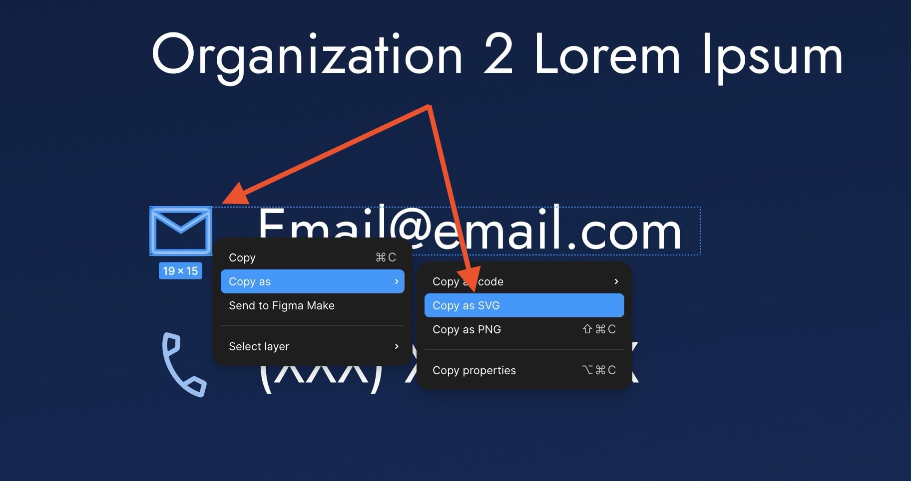
- In the tool notice the error
Only the <path> element is allowed, try again., simply delete the<svg>starting and</svg>ending tags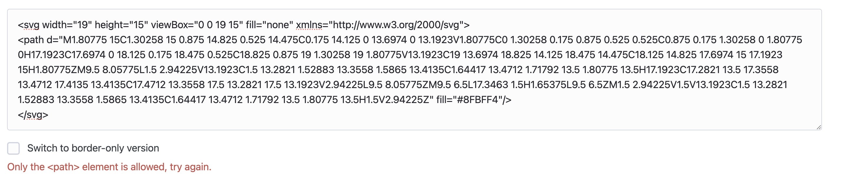
- Visually confirm that the output in the generator matches the svg (ignore the color gradient, this will be applied as a solid color in css)
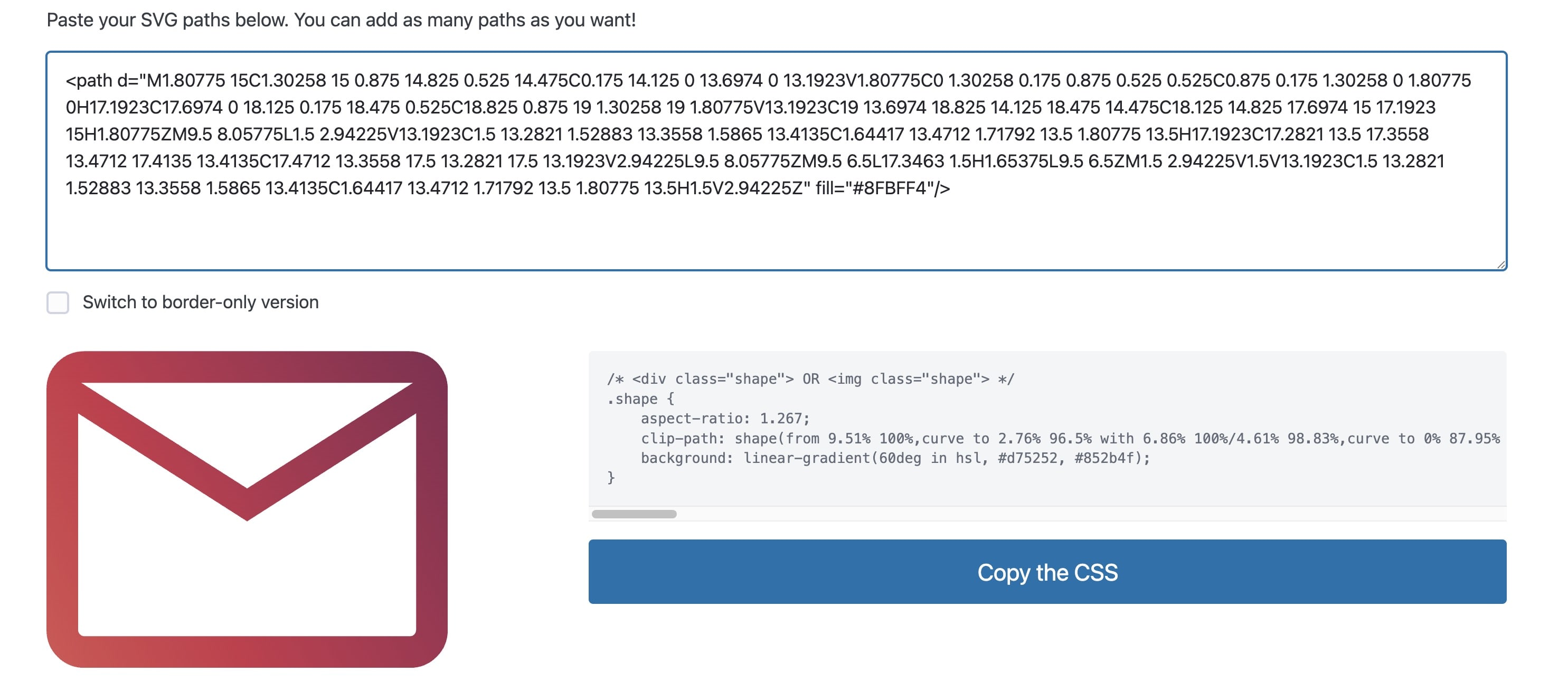
- Click the "Copy the CSS" button to copy to clipboard, the two relevant css properties are the
clip-pathand theaspect-ratio— Replace or add the value of theclip-pathproperty as a new icon in thevariables--icons.cssfile - Usage varies depending on the context, here is an example of a social media icon in use in the footer. Note that the
aspect-ratiois helpful here to keep the correct shape, allowing for only the width (or height) to be changed without needing to change both values:
&::before {
  content: "";
  aspect-ratio: 1.004;
  clip-path: var(--icon-facebook);
  display: block;
  width: 25px;
  background-color: var(--color-white);
}
IcoMoon (Older ICL versions)
IcoMoon is used to create a sprite sheet to reference all icons:
SVG Preparation
- Remove any fill colors on elements in the svg, this will default colors to black so they can have color applied with css.
- Provide a meaningful name for the icon (no need to include the word "icon" as it will be automatically added when using IcoMoon)
- Optimize the
svgby running it through SVGOMG. Make sure that the "Prefer viewBox over width/height" option is checked in the Global Settings panel. This will replace any usages ofwidthandheightattributes withviewBoxwhich allows icons to be responsively scaled on a case-by-case basis.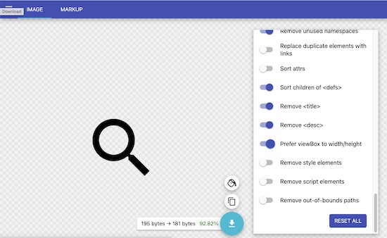
Using IcoMoon
-
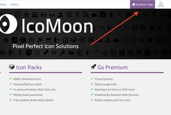
Go to icomoon.io and click IcoMoon App in the top-right corner
-
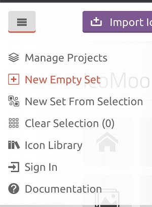
If starting a new project, click the hamburger menu in the top left and select "New Empty Set"
-
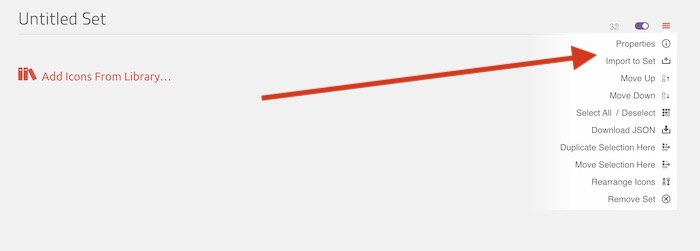
Click the hamburger menu that appears near the top right.
-
Choose "Properties" to update the set name
-
Choose "Import to Set" to import svgs from your machine
-
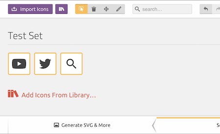
Once the icons are in the set and ready to be downloaded, choose "Generate SVG & More" from the bottom left
-
Your downloaded package will contain two files that you will need to pull into your project (or replace if you're updating your project as opposed to starting), these files are
selection.jsonandsymbol-defs.svg. Tracking these files in your repo ensures that you or another developer will be able to re-import into IcoMoon in the future (no login needed for IcoMoon - it uses local storage). The other files in the package can be deleted.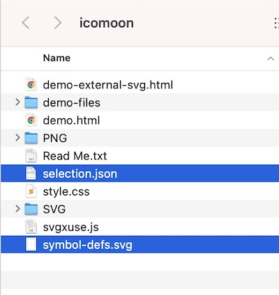
-
Place (or replace) the
selection.jsonandsymbol-defs.svgfiles into the directory created earlier atyour-project/source/images/icons
Adding to Your Project
- ICL Version 3+ (Astro)
- ICL Version < 3 (Pattern Lab)
- Place a copy of the source svg icons from the design file in
public/images/iconsin case they need to be referenced/modified later - Modified files from IcoMoon will come in the form of a file calledsymbol-defs.svgstored/replaced-on-update atsource/images/icons/icomoon/symbol-defs.svgand copied into aiconset.svgatsrc/components/iconset/iconset.svg, which is included on all pages of the site in order to be referenced - Place (or replace if it already exists) a copy of theselection.jsonfile from IcoMoon atsource/images/icons/icomoon/selection.json, this will allow future developers to modify/update the iconset in IcoMoon
- Copy the contents of the
symbol-defs.svginto a new file callediconset.svg. This ideally should exist (in Pattern Lab) atyour-project/source/_patterns/core/iconset/iconset.svg. Each time you update and re-download from IcoMoon, update the contents of this file to match. Older projects (including fractal) may not have this directory or file, so create to match as needed. - Ensure that
symbol-defs.svgis included on each page. In Pattern Lab in thehead.twigfile this is included after theskip-linkafter the opening<body>tag as{% include "@core/iconset/iconset.svg"%}. This allows usage of the sprites.
Details
SVG Usage
To use a sprite use the following syntax, where#icon-id matches the name of the <symbol> to the desired icon in iconset.svg<span class="visible-for-screen-readers"
>Name of icon (acts as alt text for screen readers not a decorative image. Can
be skipped if decorative)</span
>
<svg aria-hidden="true" width="20" height="20">
<use xlink:href="#icon-id"></use>
</svg>
</span>